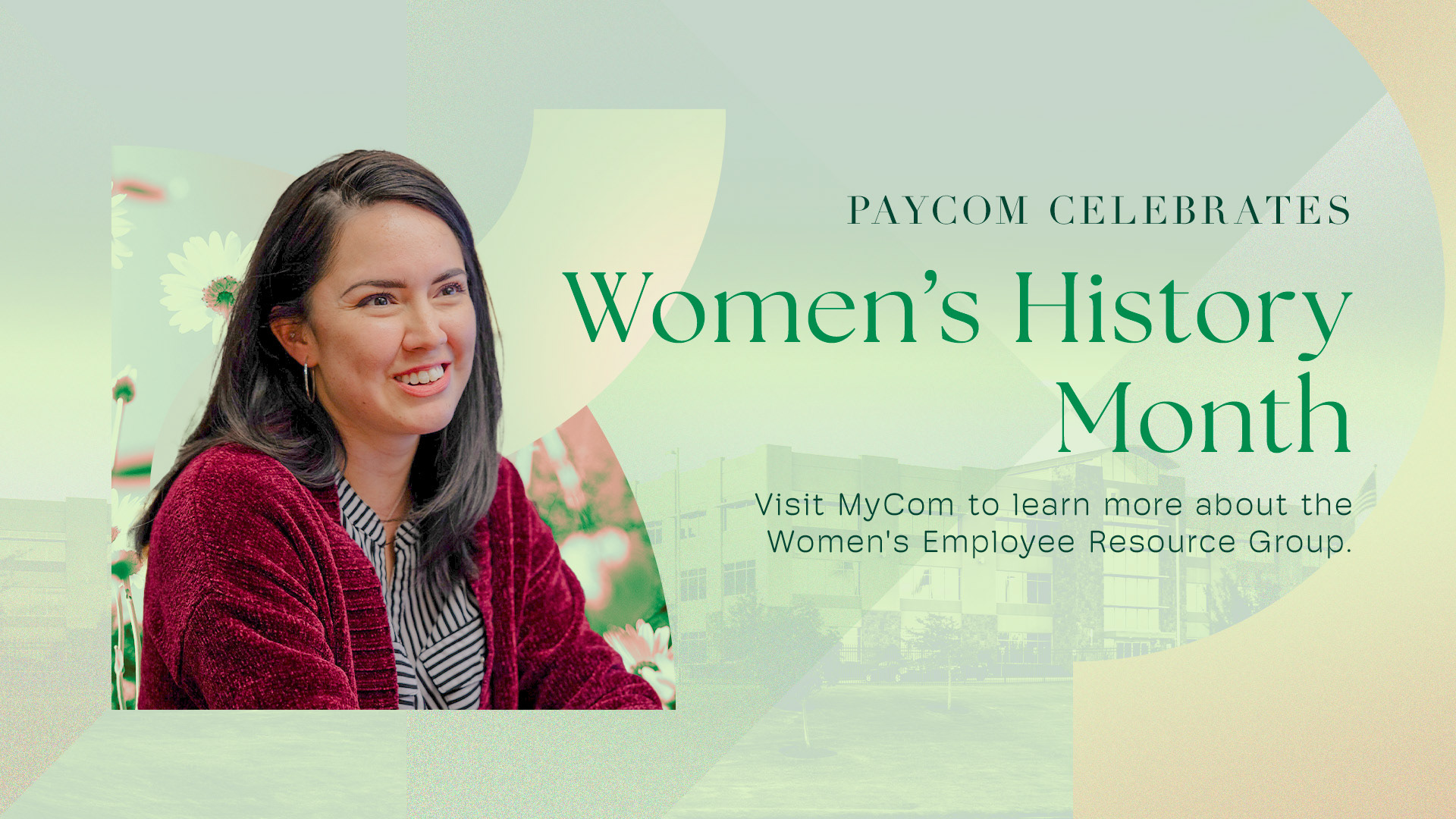
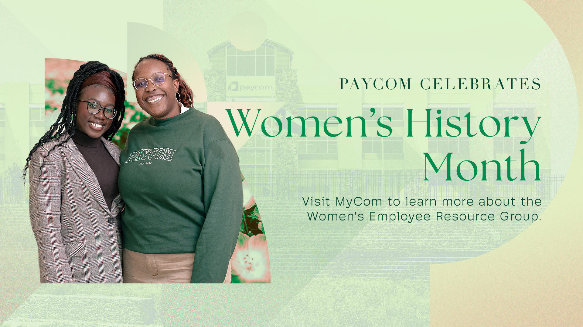
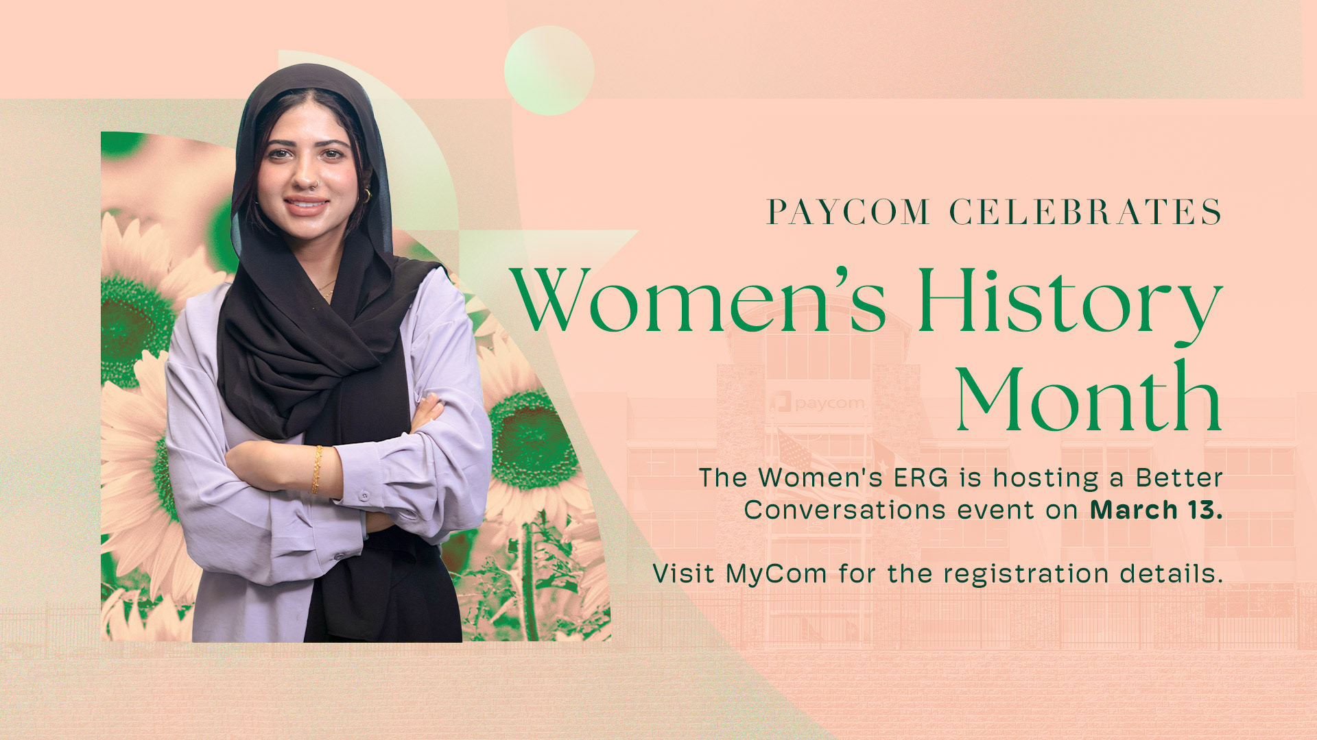
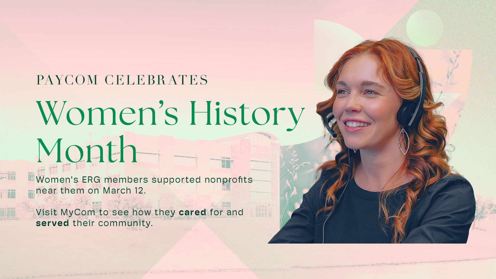
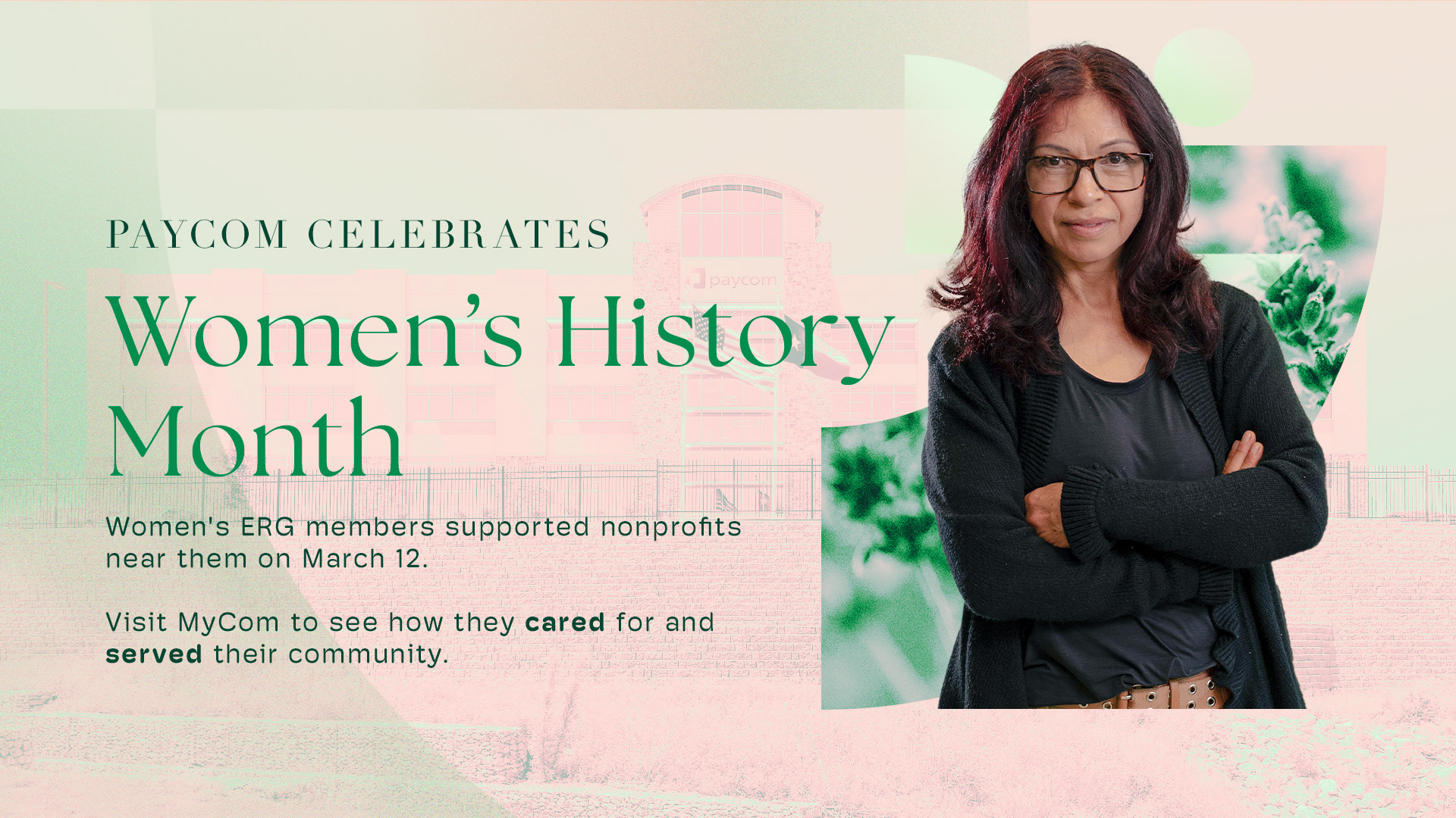
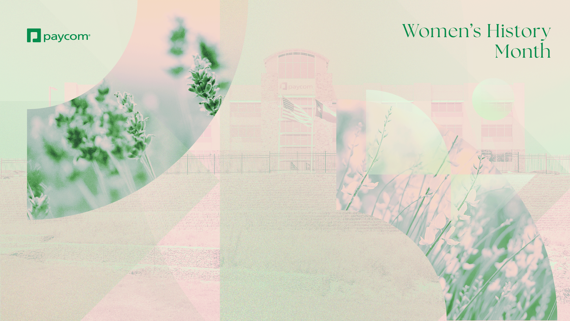
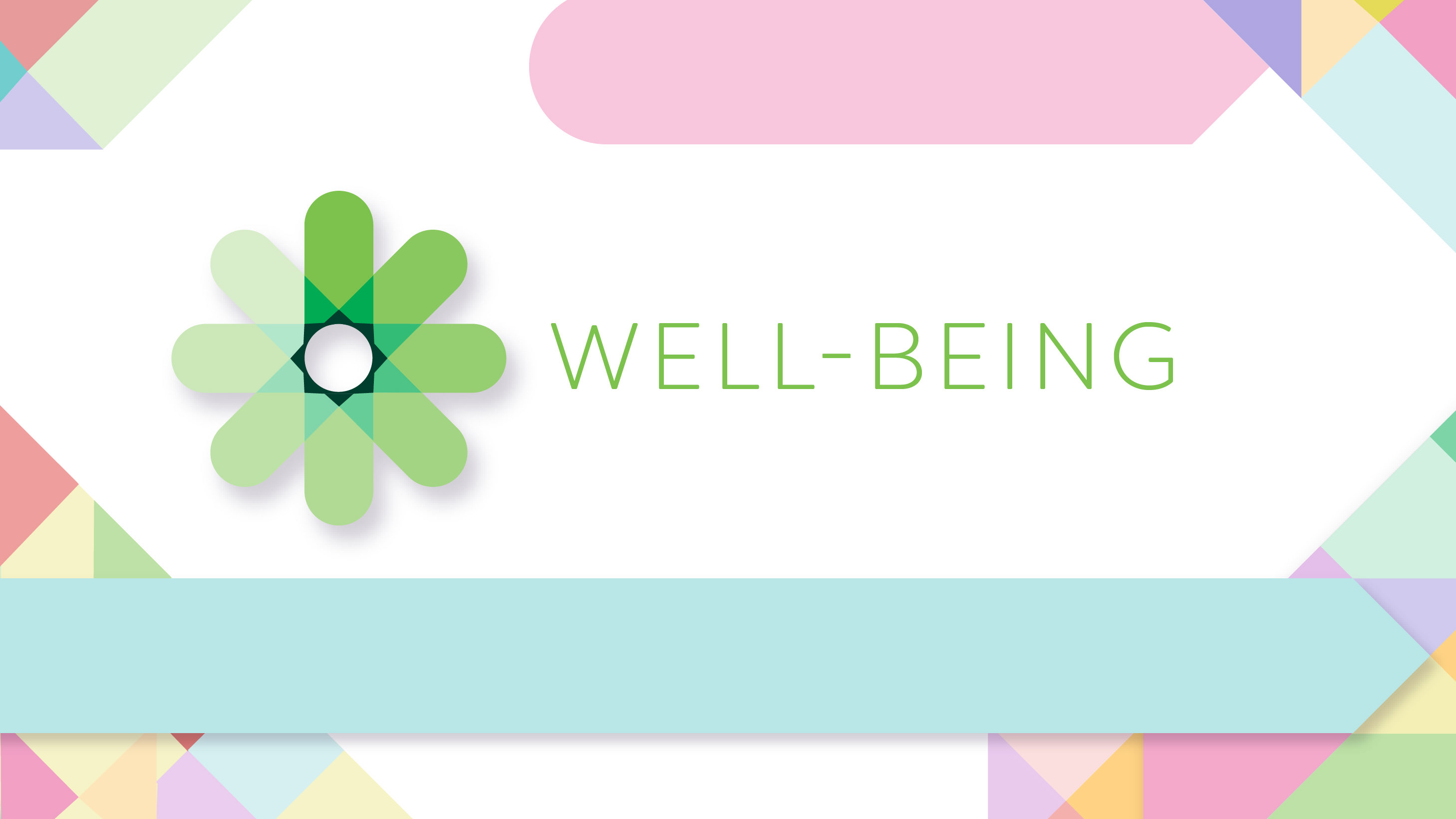
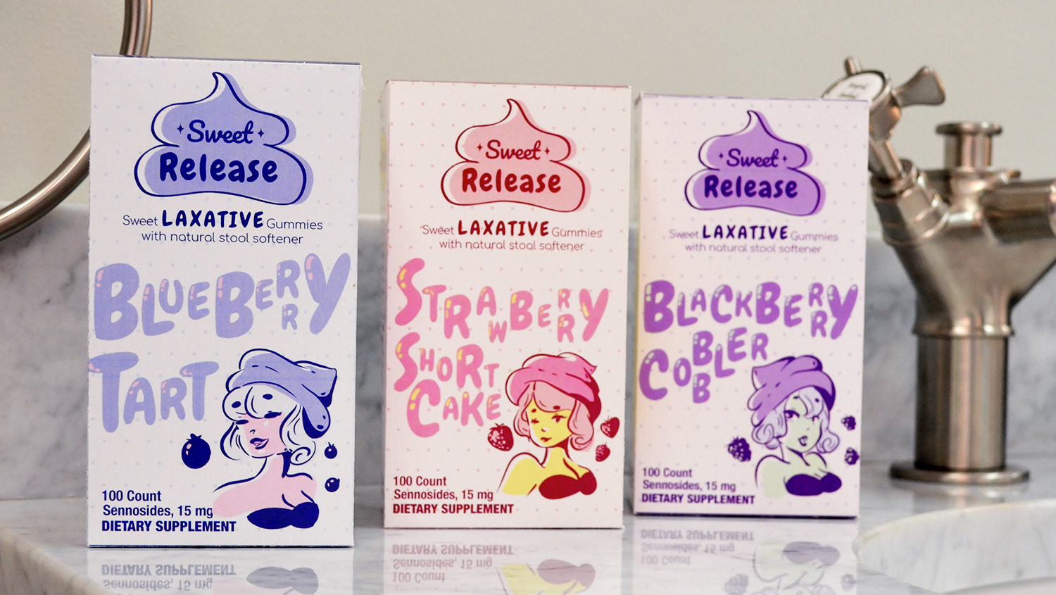
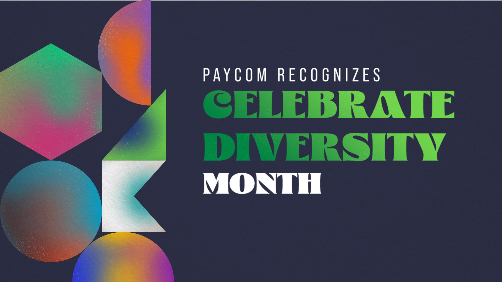
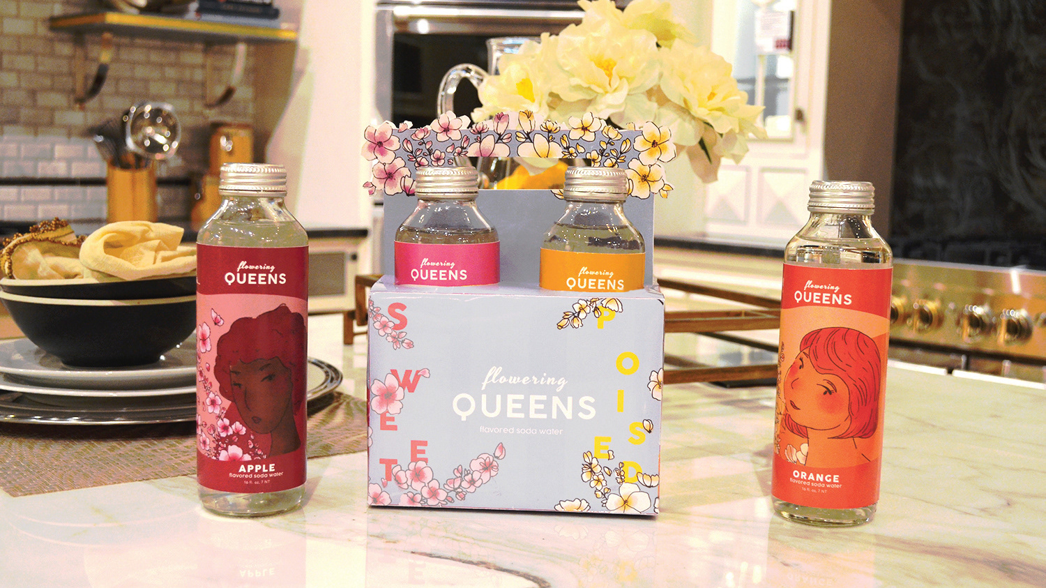
Up until now for women's history, I think we went in a really strong and bold design direction. This year I wanted to switch it up and emphasize the power in soft femininity. Still using the shapes but making them more soft and understated. And instead of having all the employees in a sort of grid, I leaned more towards having multiple versions of women employees featured that can rotate out more frequently throughout the month. Photos are also edited to be softer and compliment the color palette.
