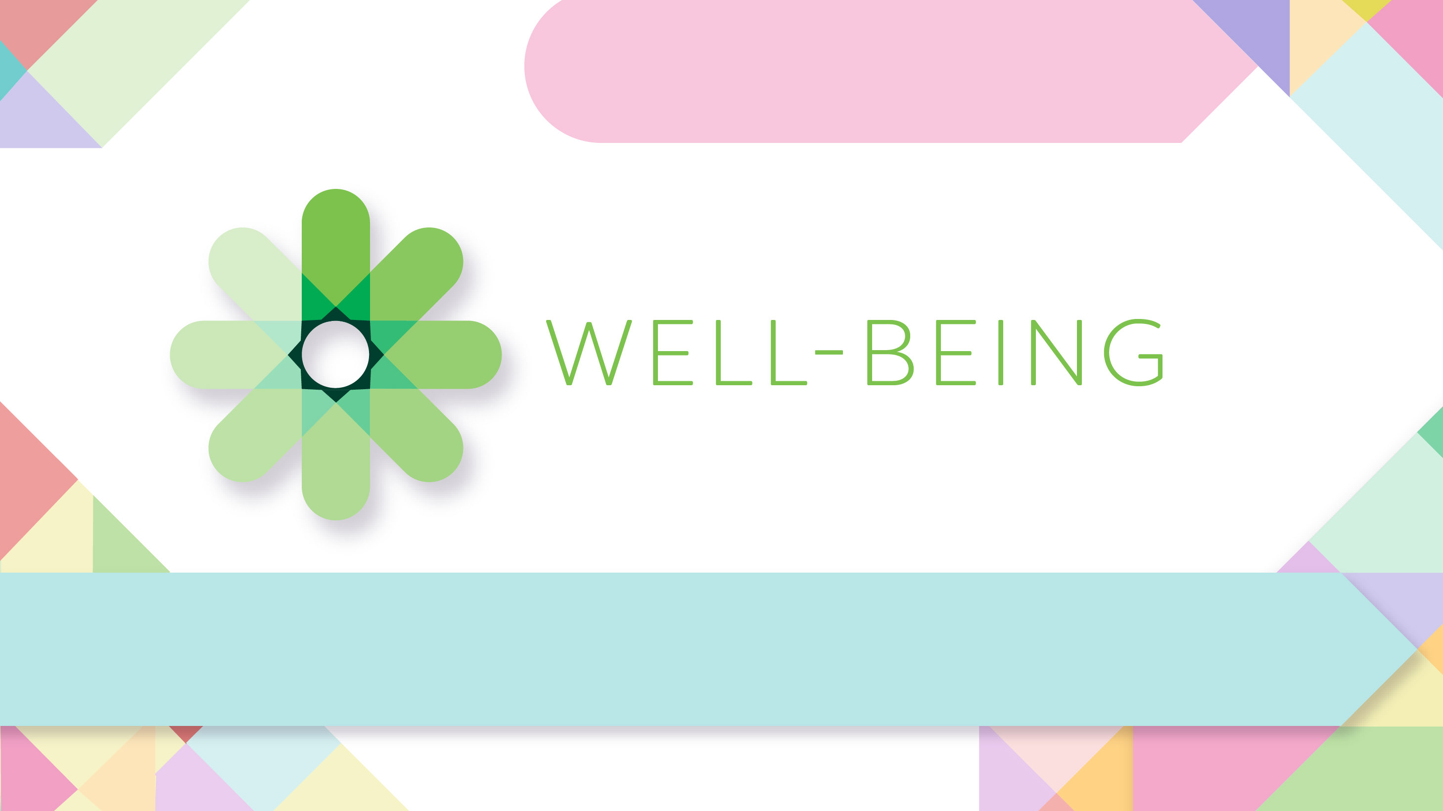
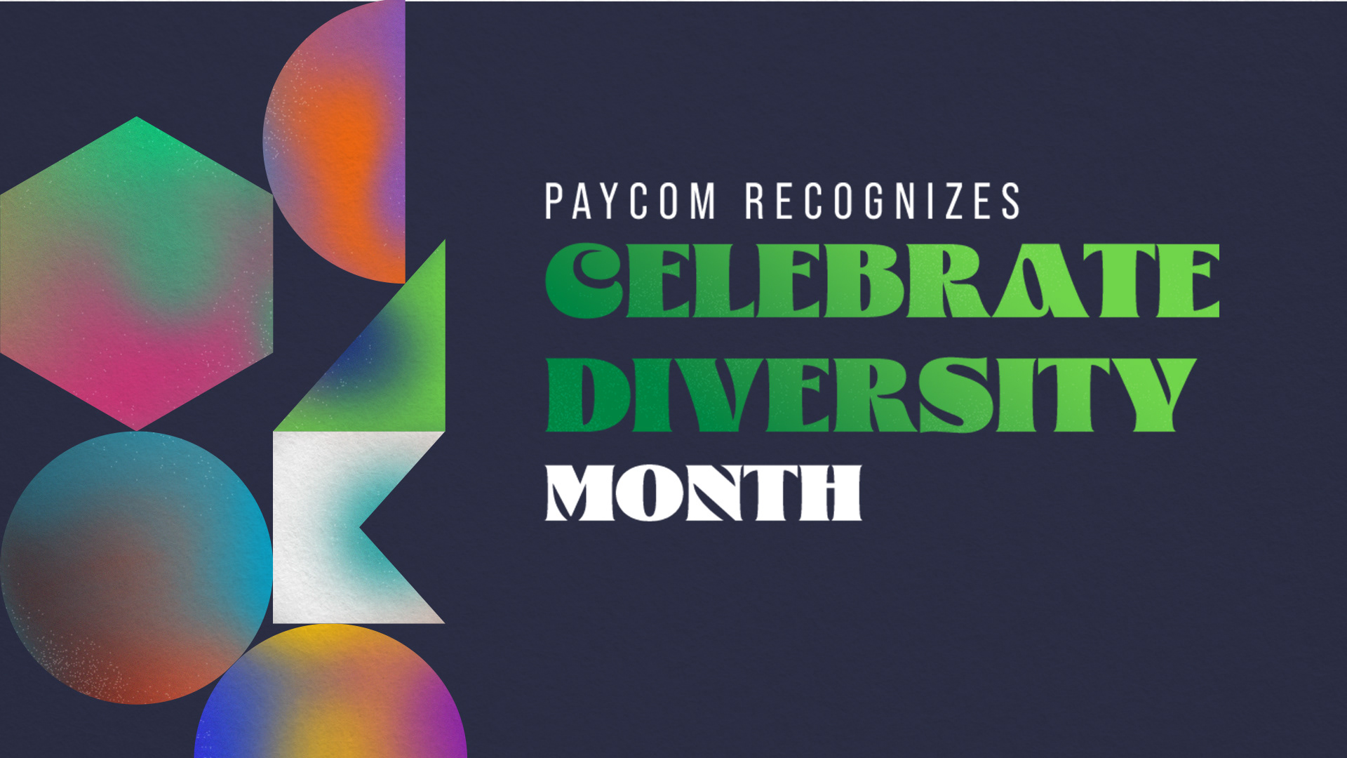
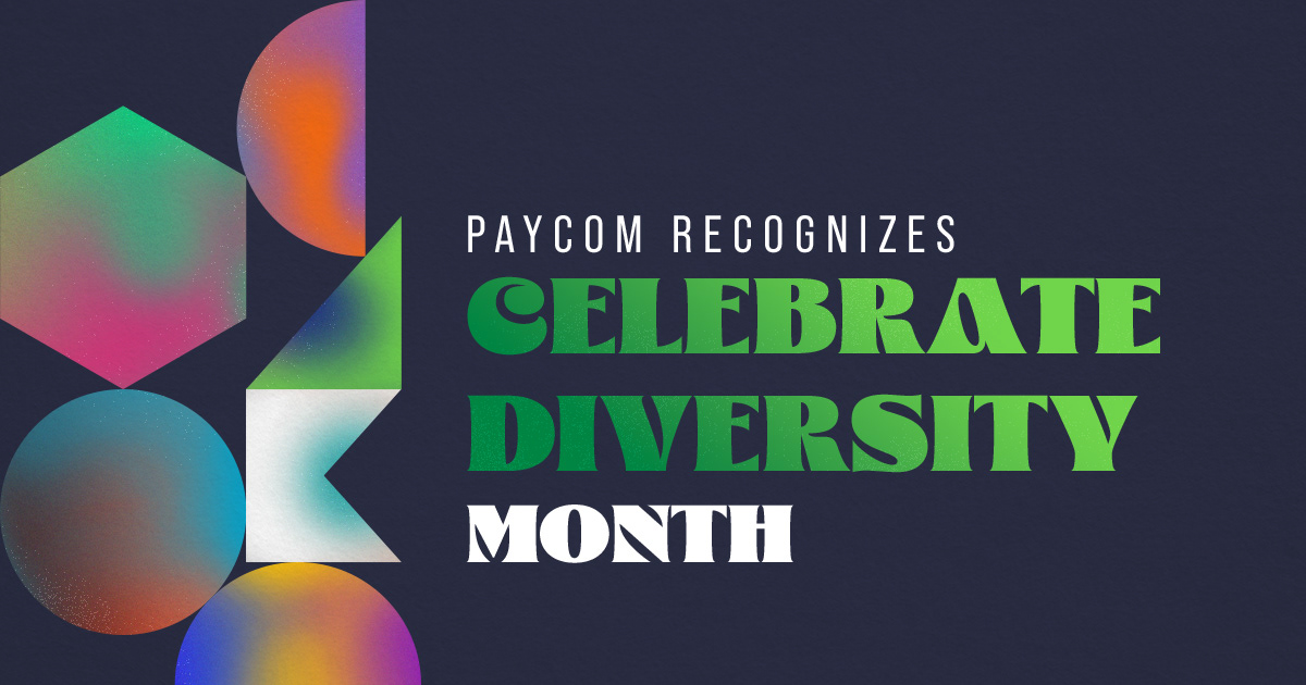
I didn't want to go the normal route of vectored hands of diff. skintones or that sort of theme, so I tried to go more abstract and conceptual with the idea. I started looking up "kaleidoscope" (kaleidoscope=different shapes and colors forming together for a unique picture) imagery, and sort of reverse-engineered the layout so I would keep the spirit of different colors and different shapes, still together. Happy accident that it looks sort of reminiscent of the beti/paycom pattern but I ended up thinking it was a nice touch and a subtle reference to the company. I was inspired by a lot of bold colors and psychedelic imagery as well, and chose a fun typeface to fit the vibe of the overall peace. Also added a little more texture to the whole thing to make it feel a little less plasticky.